Wednesday, December 5, 2012

Web page progress 3

Here are a few progress screenshots of my web page. The 1st image is my page from class on Tuesday; the second screenshot is how my page looked after working on it after class on Tuesday. In the 2nd version, I added more line height in the head div. I also had permission from Professor Pannafino to increase my pixel width from 800px to 1000px, which really helps. I also added some of Ellen Lupton's book cover images to my left & right sidebar divs, decreased the font size, and increased their widths, per Mr. Pannafino's suggestions.


He also suggested adding a larger image to the middle div, which I did. Instead of one image, I added a FlexSlider slideshow of a few of Ellen's paintings, courtesy of Woo Themes. I also changed the background from white to an image from Subtle Patterns called "padded" and added the yellow-orange color from the cover of "Thinking with Type" to the header & footer. To add some emphasis on the typographical elements, I added some accent classes. I need to adjust the size of the FlexSlider next, and possibly change the background.


Below is my final version of my web page. I tried for hours to get the FlexSlider to a more suitable size, but could not fix it after trying a few remedies posted by others on the Web. I also tried resizing the larger images, but it didn't help at all. I did end up changing the background image to "Type" from Subtle Patterns. I thought this was appropriate since Ellen Lupton's design focus is typography.


Wednesday, November 28, 2012

Web page progress 2

I decided to remove the orange background on my wrapper div and the type background I made in Illustrator because it was too much distraction. Instead, I used white for the background color, added a slight drop shadow property (with CSS3) to the wrapper div, and used typography, font color and line to create less distracting visual elements. In the header, I adjusted the line height; and for the heading under Ellen Lupton, I adjusted the letter spacing property. I also found a way to add a drop cap with CSS, which is something new I learned.

Getting the layout right was a lengthy process of trial and error. I think there should be a little more padding, but the text in the sidebar divs is too choppy so maybe I need to remove one of the sidebar divs or find another way to fix it. I wanted to have my layout be fluid - where all my divs retain their positions when the browser window is resized or when the page is viewed on a mobile device. I'll ask Professor Pannafino if he would accept %'s as width measurements instead of pixels.


I also validated my HTML and CSS with W3C and both documents were valid! :)


This is a background I made with Photoshop and was thinking of experimenting with but I think I'll have the same issue with it. I'll try it tomorrow during in-class work time. Maybe I'll try using Ellen Lupton's Punctuation illustration as an inspiration to create something.


Sunday, November 25, 2012

Webpage progress

This is a screen capture of my webpage so far. I based it on the cover of one of Ellen Lupton's books, Thinking with Type. The image appears on the cover of another of Ellen's books, Design Your Life. I found the image on the Walker Art Center's website. I sampled the color directly from the image of the book cover on Ellen's website.


The background was done in Illustrator and is similar to (but not exactly ) the font background on the cover of the aforementioned book. I may change it to something else.

Tuesday, November 20, 2012

A few layouts for my webpage

Here are some sketches for my webpage layout:


CSS exercises

These are screenshots of the exercises that were assigned last Thursday. (I wasn't sure if Professor Pannafino wanted them posted or not so I'm posting mine just to be safe.)


Monday, November 19, 2012

Ellen Lupton

Besides being an accomplished graphic designer, Ellen Lupton is the MFA program director at Maryland Institute College of Art (or MICA); the director of the Center for Design Thinking at MICA; and is a contemporary design curator at the Cooper-Hewitt National Design Museum in New York City. She has also had the high honor of being awarded a Gold Medal by the American Institute of Graphic Arts. Ellen has written articles for the New York Times and several books, including quite a few with her identical twin sister, Julia, who has a PhD in Renaissance Studies.
Ellen Lupton’s primary design focus is typography, underscoring “design as living practice—not theoretical debates, but doing work in the studio”. She was influenced by Bauhaus, which was a German school of design that analyzed the basic geometric elements of form.
I was struck by Ellen's response to an interview question on Planet Typography's website where she was asked to comment on her comment, "think more, design less". Her response stated that design students sometimes overuse drop shadows, gradients, transparent boxes, etc. to compensate for lack of a strong concept. Her response to this problem was, "I argue that it is their job to make the message interesting and compelling, not to bury it with empty visual gestures." This really spoke to me because I've been guilty of doing this exact thing... but I'm aware of it and am attempting to do something about it.

Saturday, November 17, 2012

Chosen designer: Ellen Lupton

Ellen Lupton is my chosen designer for our third and final project, an HTML webpage styled with CSS. This is a project I've been looking forward to because I have experience with HTML, CSS, Dreamweaver, and HTML editors (plus a little C#, Visual Basic, JavaScript, and XML). I'm actually one credit shy (just a silly little phys ed course) of obtaining my Associate's Degree in Web Design and Development through Harrisburg Area Community College, but I know there's always room for improvement. While I learned the technical skills for creating a website (and have built quite a few already), I don't recall critical thinking being quite as emphasized at HACC like it is here at Millersville. So, I'm excited to build on my existing skills with this project... which is exactly why I decided to pursue a Bachelor's Degree in Graphic and Interactive Design (and I've already learned so much!).

My first designer choice was John Lasseter, whom I highly admire for his Pixar movies. There isn't a Pixar movie that I don't like. But I decided to go in the opposite direction as an attempt to challenge myself with type design, line and simple color accents, not full-out color and heavy graphics. I love color, so my designs tend to reflect that by having lots of color but little to no white. I chose Ellen Lupton because her design emphasis is typography, which is an area of interest for me, but haven't had a full class in typography yet. The first element I noticed on her website was her book, Thinking with Type. I've attempted to use type as a visual element on my own but haven't been impressed with my results yet so I'm giving it another try. (When it comes to designing, I don't give up easily!) Professor Pannafino told us ahead of time to be open to a challenge, so I think I am open to a challenge by choosing this designer. My research on Ellen Lupton will be my next post.

Saturday, November 10, 2012

Some wishes do come true!

On my way to class last Thursday, I wished I had a little more time to work on my magazine cover because I knew I could do better than what I submitted on Thursday. Fortunately for me, a classmate asked Professor Pannafino for the chance to make some changes and resubmit. I've used that time to make some nice improvements. Now it looks more like a magazine cover and I'm much happier with the results. (The blue border will be trimmed off before I mat it on blackboard.) Thank you for the additional time, Professor Pannafino!
I changed the font of the sell lines from Bubbleboddy to Cooper Black and tried to incorporate the colors from the logo and the background (my two vector images, all handmade & inspired from two different images).
Once again, during the critique, I am so impressed with the talent in our class. I really enjoy hearing from others about their projects, as well as what others see that I may have missed. And of course, instructor feedback is always something I value highly. I am always so terribly nervous during critique days, but they are always so incredibly helpful.


Wednesday, November 7, 2012

Finished Magazine Cover


This is my finished magazine cover. After much rearranging, this is the final layout I decided to use. I added a slightly opaque rectangle at the bottom for the featured articles to help make them appear as a group. Originally, I had the featured article graphics on the left and bottom of the main image but wasn't happy with the way it looked.


Monday, November 5, 2012

Magazine cover progress

Here's my magazine cover so far. I've been going back and forth on where to place my images & I'm still not   happy with it yet... I know I can do better but this has been challenging with the images I chose to work with.   To help my captured image fit into the circus theme, I tried painting the faces to make them look like clowns but I'm still working at it because I'm not happy with the results yet.


For my logo, I changed the word "the" and made it vertical rather than arched like in the previous version. I also removed the blue background and made it a separate image for the magazine cover background.

Tuesday, October 30, 2012

"Under the Tent" masthead

Some more work I've been doing on the masthead I posted last time:


When finished, it will look something like the second image- I love the stripes behind the clown and am working on recreating them.


An hour or so later, it's almost finished. I'll make some more minor adjustments & add the word "Magazine" underneath the words "Under the Tent".


I think this masthead is finished. I thought the space around the tent looked bare so I added some swirls with the same gold gradient that I used on the circles in the tent & around the ellipse around the title.


Saturday, October 27, 2012

Mastheads

These are the mastheads I created tonight. I really like the 1st one so far. 
I keep forgetting to mention this, but I'd like to maybe incorporate juggling somewhere in the masthead. Maybe simplified down to just circles to symbolize the balls being juggled? I'm trying to keep my designs on the simpler side... I have a tendency to over-complicate things. 
I plan to work a little more on the 2nd and 4th mastheads this weekend. (It's very late and I'm getting tired!)


Friday, October 26, 2012

Magazine titles part II

Here are a few more samples of magazine titles and fonts for my project. I went back to DaFont.com and Fontsquirrel.com but didn't find anything that I missed or looked over the last time. When I found 1001Fonts.com, I was able to find some new fonts that I wanted to try for my masthead. I found a font called Mars Attack, which I think is similar to the font used in the Monsterpalooza masthead, but I'm not sure I will use it. The titles I like are:

  • It's All Fun & Games
  • Fun & Games Magazine

As for the fonts, I like FineOMite (#2) and Videophreak (#4). FineOMite has a fun look and feel to it. It isn't as readable at a small size but should be fine for a masthead. Videophreak is obviously a video game font, which I think works well for the direction I'm heading (family and games).

Below are 2 mastheads I've been working on tonight. I discovered some dot pattern swatches in the swatches panel, which is what I used for the ampersand in the 1st sample (Basic Graphics_Dots). In the 2nd sample, I used another pattern in the Decorative Modern swatch group called Optical Checkerboard. This was the first time I used this swatch group and I know I'll use it again in other projects. These exact colors may change and I'll experiment more with the 2nd sample's pattern.


Thursday, October 25, 2012

Magazine project: title ideas

These are the new fonts I downloaded from DaFont.com today. I'm leaning towards Sniglet, Adventure, and the Janda family. (The last one reminds me of the Ben & Jerry's ice cream font.) The titles that I like most are:  
  • Family Game Night
  • Family, Fun & Games 
  • Family Amusement 
  • and Family Games & Adventures 


In class, Professor Pannafino showed us examples of a past student's progress blog. I noted that the author wrote how she forgot to create outlines of a special font she used, so when she worked on it on another computer, the font was missing. I've had this happen to me a few times before & it never occurred to me to convert the type to outlines first, but from now on, I'll be using this method for cases like this where I'm going back and forth between the lab and my home computer.

The example below caught my attention as I was searching for magazine masthead designs. I like the different sizes of the letters and how the end letters seem to lean in towards the center. I am planning to try something similar, with the end letters more concave (like the purple shape below). Below the magazine cover example is an idea for the masthead using Sniglet as the font. I like the roundness of this font- it has a fun look to it.


Magazine cover sketches


Here are my sketches for my magazine cover project. This was my first time using a Wacom tablet (we had other tablets at HACC, but I didn't use one for any of the courses I took) and it was tough getting used to it. I find that it is more challenging to be creative with such a constricting theme. I understand the reasoning behind the concept of the this project.... as designers in the working world, at times we will need to conform our designing to a certain style with preconceived concepts by clients or project leaders. This project is challenging to think beyond the two chosen topics and come up with some creative ideas that reflect the thought I have invested so far.
So, back to my designs... I like the first one- but maybe with a different angle? The second and third sketches may be a little bit unimaginative, but I do like their layouts. I still need to create the magazine title. I'm definitely staying with family and kids as the intended audience so that should help narrow the creative flow. As for my composite images, I was considering taking pictures of my husband, son and myself to use as my captured image. I need to think more about the scanned and vector images.


Tuesday, October 23, 2012

My moodboard


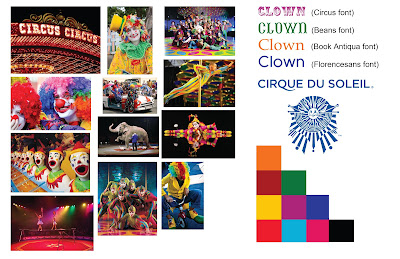
This is my moodboard for the clown theme that was chosen for us (the green team) by the other teams. From the clown theme, my next logical thought was circus, so I went in that direction and added items that are associated with clowns. It was only this evening that I finally came up with a better idea, which is Cirque Du Soleil. I am just now gathering photos & will add them, change the colors & fonts. 

I wasn't able to find many usable images for Cirque Du Soleil, so I added them to what I had in the moodboard above. The font used in the Cirque Du Soleil is called Gotham, a paid font. I'm looking for alternatives to this font.


Who is the target audience?
                Families? 
What is the name of your magazine? Why? Connotations?

What will your masthead look like? Do you have any ideas for fonts?
                Undecided, but probably a font similar to the font in the Cirque Du Soleil

What images will be on the cover and why?

What will be your sell lines to entice your target audience?

Monday, October 22, 2012

Green team mindmap


This is the green team's mind map. It was sometimes challenging to come up with ideas to write on the board, but it was a valuable exercise. Before taking this course, I had never done mind mapping on paper like this, but I certainly understand how important it is.
 I thought the photo composites were interesting to see, and again, how creative the students are in this class. Since I was not in class for this assignment, it is not pictured above, but I have been working on one and I'll post it as soon as it's finished later today.

Sunday, October 14, 2012

Types of Images project

The original photo scanned in the lab that was used in this project:


I consider myself as a little-higher-than-beginning user with Photoshop, and am always looking to improve my techniques or for new techniques I didn't know. I only began using Photoshop in 2010 (on a PC) so there's still plenty for me to learn yet. For instance, I never tried the line art effect (first example above). I'd like to experiment with that effect in more detail soon. I thought the duotone colors gave an interesting look, so that's another effect I'd like to experiment with more.

Since I put some time into making the vector piece, here is it by itself:


Saturday, October 6, 2012

The finished seed packet project

This was a challenging project to accomplish, but I feel it was helpful in growing a little bit more as a designer. The critiques were invaluable by pointing out things I didn't notice in my own work and taught me how to improve design continuity. There were many excellent concepts and the work shows the talents of everyone taking this course. It was very interesting to see the designs develop from start to finish.


Keeping with the plant growing from a conceptual illustration in the first two packets, Job seeds and Small Business seeds, I chose the piggy bank to represent Consumer Spending seeds. The idea behind the Consumer spending is when people have some leftover money in savings accounts (i.e. piggy banks), they will spend it at those small businesses represented in the second illustration. I chose roses for the third packet with the idea that increased consumer spending is a "sweet smell" to many people because of the positive impact it bears on our country's economy.
The concepts are all related and are all some things our country really needs. Small business creates more jobs, more jobs increases consumer spending which helps those small businesses, and increased consumer spending helps the employment rate increase.

Here's what the packets evolved from before the end product:


Below are the mounted packets and the back of the Job seeds packet. These photos taken in the lab didn't turn out the best, but here they are regardless:


Thursday, September 27, 2012

My second seed packet is about 1/4 way done. My idea for this packet is small business seeds, which in my mind is related to helping our economy grow, creating more jobs and increasing consumer spending (which will be my third packet).
I put a lot of detail into the light bulb and the trunk of the tree. The light bulb represents an idea, since any business first starts with an idea. I applied a gradient to the strokes of the trunk and branches, which I needed a refresher to accomplish. The method I used (since I have CS5.1) was to select the stroke with the Direct Selection tool, then I chose Object from the menu bar, then Path, then Outline Stroke. I decided to apply gradients to the trunk and branches of the next plant because there is an outer glow effect applied to the top of the light bulb. The Outer Glow effect is intended to convey brightness and an attempt at balance with lighting with the sun.
The roots are similar to the first packet. I added some roots to give it a more complete feel, and the trunk grows out of the light bulb. I intend the plant to be a bush or a small tree with related elements like I did with the Job Seeds packet.

I also have made changes to the first packet based on comments/suggestions by classmates. I removed all the additional plants, which I placed there with the idea of having it appear as a field with lots of new jobs growing. It was a last minute decision to add them because I thought it looked too bare. But now looking at the revised version again, it does look better with space around the plant and flowers.