Tuesday, October 30, 2012

"Under the Tent" masthead

Some more work I've been doing on the masthead I posted last time:


When finished, it will look something like the second image- I love the stripes behind the clown and am working on recreating them.


An hour or so later, it's almost finished. I'll make some more minor adjustments & add the word "Magazine" underneath the words "Under the Tent".


I think this masthead is finished. I thought the space around the tent looked bare so I added some swirls with the same gold gradient that I used on the circles in the tent & around the ellipse around the title.


Saturday, October 27, 2012

Mastheads

These are the mastheads I created tonight. I really like the 1st one so far. 
I keep forgetting to mention this, but I'd like to maybe incorporate juggling somewhere in the masthead. Maybe simplified down to just circles to symbolize the balls being juggled? I'm trying to keep my designs on the simpler side... I have a tendency to over-complicate things. 
I plan to work a little more on the 2nd and 4th mastheads this weekend. (It's very late and I'm getting tired!)


Friday, October 26, 2012

Magazine titles part II

Here are a few more samples of magazine titles and fonts for my project. I went back to DaFont.com and Fontsquirrel.com but didn't find anything that I missed or looked over the last time. When I found 1001Fonts.com, I was able to find some new fonts that I wanted to try for my masthead. I found a font called Mars Attack, which I think is similar to the font used in the Monsterpalooza masthead, but I'm not sure I will use it. The titles I like are:

  • It's All Fun & Games
  • Fun & Games Magazine

As for the fonts, I like FineOMite (#2) and Videophreak (#4). FineOMite has a fun look and feel to it. It isn't as readable at a small size but should be fine for a masthead. Videophreak is obviously a video game font, which I think works well for the direction I'm heading (family and games).

Below are 2 mastheads I've been working on tonight. I discovered some dot pattern swatches in the swatches panel, which is what I used for the ampersand in the 1st sample (Basic Graphics_Dots). In the 2nd sample, I used another pattern in the Decorative Modern swatch group called Optical Checkerboard. This was the first time I used this swatch group and I know I'll use it again in other projects. These exact colors may change and I'll experiment more with the 2nd sample's pattern.


Thursday, October 25, 2012

Magazine project: title ideas

These are the new fonts I downloaded from DaFont.com today. I'm leaning towards Sniglet, Adventure, and the Janda family. (The last one reminds me of the Ben & Jerry's ice cream font.) The titles that I like most are:  
  • Family Game Night
  • Family, Fun & Games 
  • Family Amusement 
  • and Family Games & Adventures 


In class, Professor Pannafino showed us examples of a past student's progress blog. I noted that the author wrote how she forgot to create outlines of a special font she used, so when she worked on it on another computer, the font was missing. I've had this happen to me a few times before & it never occurred to me to convert the type to outlines first, but from now on, I'll be using this method for cases like this where I'm going back and forth between the lab and my home computer.

The example below caught my attention as I was searching for magazine masthead designs. I like the different sizes of the letters and how the end letters seem to lean in towards the center. I am planning to try something similar, with the end letters more concave (like the purple shape below). Below the magazine cover example is an idea for the masthead using Sniglet as the font. I like the roundness of this font- it has a fun look to it.


Magazine cover sketches


Here are my sketches for my magazine cover project. This was my first time using a Wacom tablet (we had other tablets at HACC, but I didn't use one for any of the courses I took) and it was tough getting used to it. I find that it is more challenging to be creative with such a constricting theme. I understand the reasoning behind the concept of the this project.... as designers in the working world, at times we will need to conform our designing to a certain style with preconceived concepts by clients or project leaders. This project is challenging to think beyond the two chosen topics and come up with some creative ideas that reflect the thought I have invested so far.
So, back to my designs... I like the first one- but maybe with a different angle? The second and third sketches may be a little bit unimaginative, but I do like their layouts. I still need to create the magazine title. I'm definitely staying with family and kids as the intended audience so that should help narrow the creative flow. As for my composite images, I was considering taking pictures of my husband, son and myself to use as my captured image. I need to think more about the scanned and vector images.


Tuesday, October 23, 2012

My moodboard


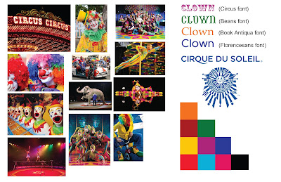
This is my moodboard for the clown theme that was chosen for us (the green team) by the other teams. From the clown theme, my next logical thought was circus, so I went in that direction and added items that are associated with clowns. It was only this evening that I finally came up with a better idea, which is Cirque Du Soleil. I am just now gathering photos & will add them, change the colors & fonts. 

I wasn't able to find many usable images for Cirque Du Soleil, so I added them to what I had in the moodboard above. The font used in the Cirque Du Soleil is called Gotham, a paid font. I'm looking for alternatives to this font.


Who is the target audience?
                Families? 
What is the name of your magazine? Why? Connotations?

What will your masthead look like? Do you have any ideas for fonts?
                Undecided, but probably a font similar to the font in the Cirque Du Soleil

What images will be on the cover and why?

What will be your sell lines to entice your target audience?

Monday, October 22, 2012

Green team mindmap


This is the green team's mind map. It was sometimes challenging to come up with ideas to write on the board, but it was a valuable exercise. Before taking this course, I had never done mind mapping on paper like this, but I certainly understand how important it is.
 I thought the photo composites were interesting to see, and again, how creative the students are in this class. Since I was not in class for this assignment, it is not pictured above, but I have been working on one and I'll post it as soon as it's finished later today.

Sunday, October 14, 2012

Types of Images project

The original photo scanned in the lab that was used in this project:


I consider myself as a little-higher-than-beginning user with Photoshop, and am always looking to improve my techniques or for new techniques I didn't know. I only began using Photoshop in 2010 (on a PC) so there's still plenty for me to learn yet. For instance, I never tried the line art effect (first example above). I'd like to experiment with that effect in more detail soon. I thought the duotone colors gave an interesting look, so that's another effect I'd like to experiment with more.

Since I put some time into making the vector piece, here is it by itself:


Saturday, October 6, 2012

The finished seed packet project

This was a challenging project to accomplish, but I feel it was helpful in growing a little bit more as a designer. The critiques were invaluable by pointing out things I didn't notice in my own work and taught me how to improve design continuity. There were many excellent concepts and the work shows the talents of everyone taking this course. It was very interesting to see the designs develop from start to finish.


Keeping with the plant growing from a conceptual illustration in the first two packets, Job seeds and Small Business seeds, I chose the piggy bank to represent Consumer Spending seeds. The idea behind the Consumer spending is when people have some leftover money in savings accounts (i.e. piggy banks), they will spend it at those small businesses represented in the second illustration. I chose roses for the third packet with the idea that increased consumer spending is a "sweet smell" to many people because of the positive impact it bears on our country's economy.
The concepts are all related and are all some things our country really needs. Small business creates more jobs, more jobs increases consumer spending which helps those small businesses, and increased consumer spending helps the employment rate increase.

Here's what the packets evolved from before the end product:


Below are the mounted packets and the back of the Job seeds packet. These photos taken in the lab didn't turn out the best, but here they are regardless: